Working with devices
To view details for a single device, click its name in the device list. The device overview page appears.
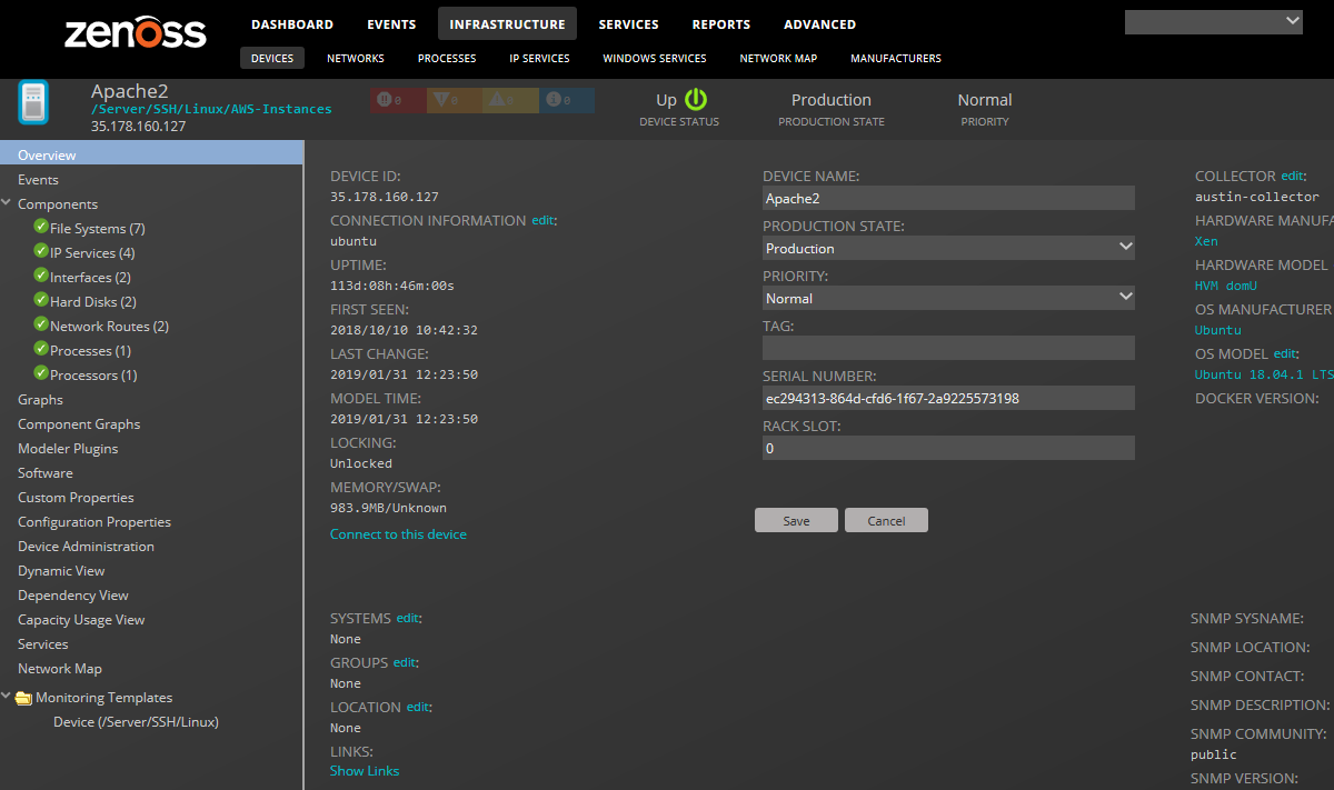
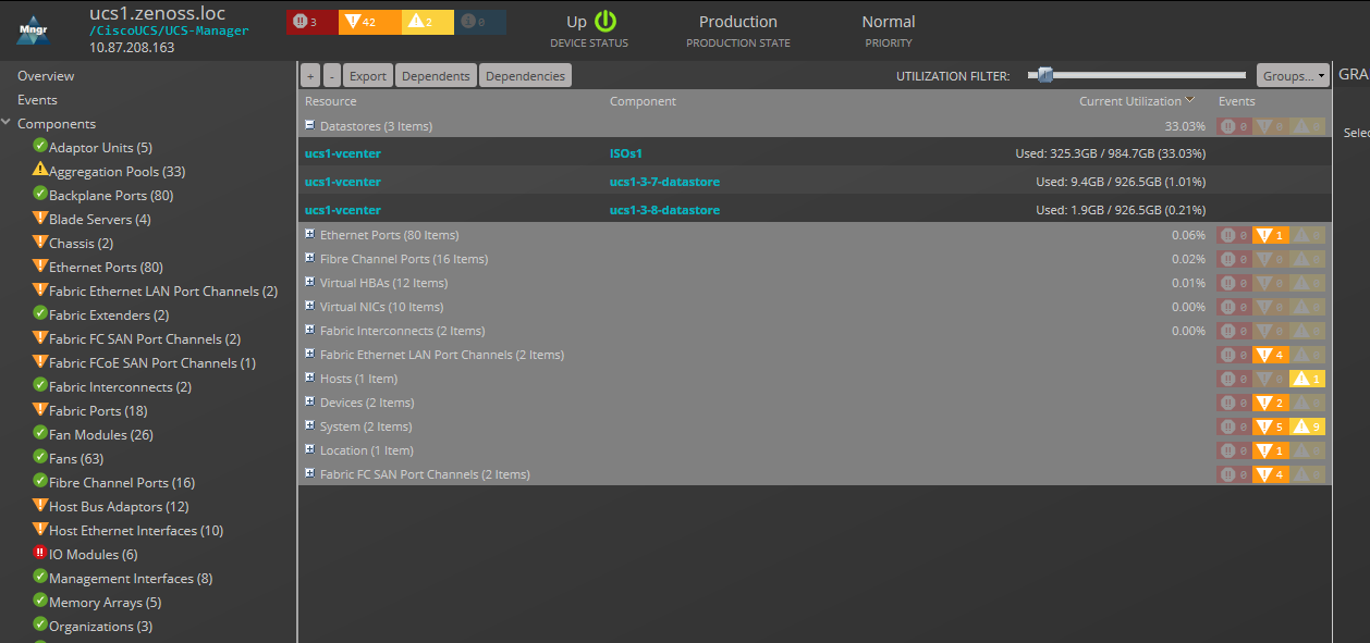
Event status is shown in the "event rainbow" at the top of the page. Other key information that appears at the top of the device overview page includes:
- Device name
- IP address used to communicate with the device
- Device status (shows the current results of a ping test)
- Production state (Pre-Production, Production, Test, Maintenance, or Decommissioned)
- Priority
When you open the page, device overview information displays. This view provides classification and status information. From here, you can edit device information (indicated by text fields or edit links).
The Links area displays links between the device and other external systems. Click Show Links to view the links.
The left panel of the device overview page allows you to access other device management views. Information that appears here varies depending on device type.
Configuration properties
Device configuration properties control the way that devices are monitored.
From the Configuration Properties view, you can set configuration properties for a device, and delete local properties from a device.
To access configuration properties, in the left pane, choose Configuration Properties.
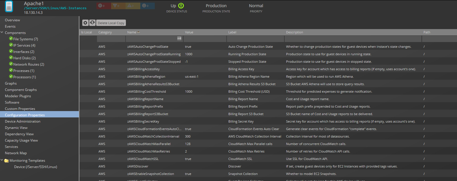
For more information, see Using configuration properties.
Custom properties
You can edit custom property values that are associated with a device.
In the device list, click the device name. In the left panel, choose Custom Properties. You can add, edit, or refresh custom properties.
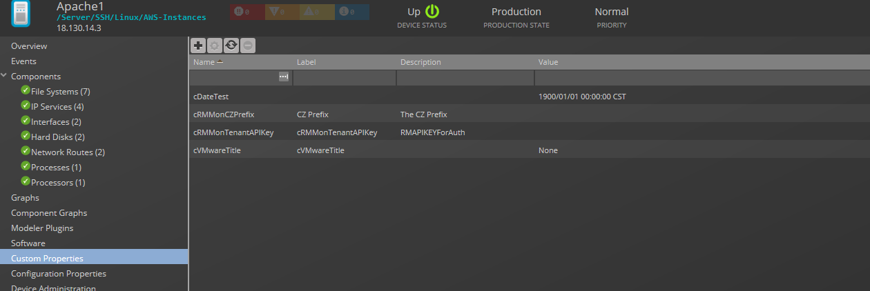
Note: The Custom Properties view allows you to edit the value of a custom property on an individual device. Adding a new custom property can be done through this view, but the property is actually added at the root of the device class tree (the DEVICES device class). Custom properties can only be removed from the Custom Properties view of the DEVICES device class.
Device administration
Use the Device Administration view to:
- Add, delete, and run custom user commands
- Manage maintenance windows
- Determine who holds administration capabilities for the device, and their roles
To access administration options, select Device Administration in the left panel.

Overridden Objects
Use the Overridden Objects view to see the objects that have overrides on their configuration properties. This view is available when looking at details of all devices.
To display the Overridden Objects view, navigate to the INFRASTRUCTURE > Devices pages and click Details. Then, click Overridden Objects from the left-column menu.
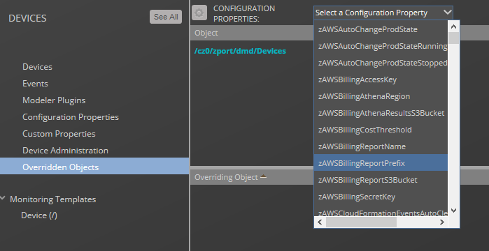
Select a configuration property from the drop-down list to view the overridden objects for that property. Double-click the row of the overriding object to open an edit dialog box.
Tip
Do not click the link of the overriding object. You will be taken to that object's page in the infrastructure view. Instead, double-click the clear area of the row of the overriding object to view the Edit Configuration Property dialog.
Software view
The Software view lists software installed on the device. The details provided in this area depend on the method used to model the device.
Listed software links into the system's inventory of software in your IT infrastructure. You can view this inventory from the Manufacturers link on the sub-navigation menu.
To access software information, select Software in the tree view.
Dependency view
The dependency view of a device shows the resources that are dependent on the selected device as well as those resources that the device is dependent on. In this view, you can see the resource, associated component, and any events related to the component.
The following table identifies the places where a dependency view is available.
| Location | How to |
|---|---|
| Device Overview page | Navigate to the device overview page and select Dependency View. |
| Device Component page | Navigate to the device overview page and select the component you are interested in. In the Display drop-down list, select Dependencies. |
| Group Details page (including Groups, Systems, and Locations) | Navigate to the Group, System or Location name and click Details. Then, select Dependency View. |
Regardless of how you navigate to the Dependency View, the functionality remains the same.
Sample Dependency View
Using Dependency View
- Click Dependents to see the resources that are dependent on the selected device or component. Click Dependencies to see the resources that this device or component is dependent on. For example, if you click the Dependency View of a Hyper-V server, you will see that VMs, datastores, and other resources are dependent on the Hyper-V server, while the server itself is dependent on the Host CPUs, HDDs, and Network Adapters (seen after clicking Dependencies).
- Click on a Component to expand its dependents or dependencies.
- Click Groups to select the resources that you want to display in the view.
- Export the data displayed by clicking the Export button. A CSV file is exported with the data as it is presented in the view.
- Click a resource name to be taken to its overview page which displays performance graphs and other details.
All selections made with respect to the display of the view will be saved so that when a particular user selects another dependency view, Collection Zone renders the dependency view using the same parameters. This is only applicable for the same user. There is no global setting available for the dependency view.
Dynamic view
Collection Zone provides a dynamic visualization of system objects and their relationships to other objects.
You can access a dynamic view from a device overview, a group, a system,or a location. Depending on the object type, different relationships are illustrated. Each dynamic view shows related objects in a graph. Each object in that graph displays its associated event information.
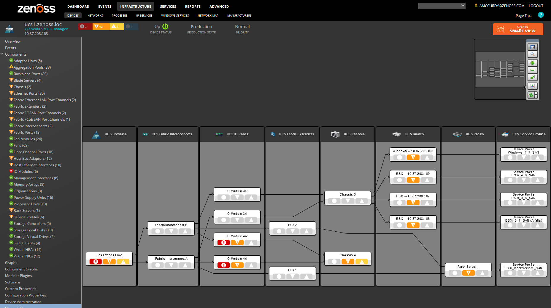
When you click an object in the graph, the "inspector" panel appears. This panel provides detailed information about the object and links directly to it. Information that appears in the inspector depends on the object type selected.
View controls appear to the right of the graph. These allow you to adjust your view:
- Overview - Toggles display on and off of the graph overview illustration.
- Magnifier - Toggles on and off the magnifier, which allows you to magnify selected portions of the graph.
- Zoom In - Zooms in on the graph.
- Zoom Out - Zooms out on the graph.
- Fit View - Fits the graph to the browser page.
- Save Image - Saves the dynamic view as a PNG image.
- Refresh - Refreshes the graph.
Events view
Detailed information about events, scoped to the device, appears in the Events view. From here, you can:
- Sort event and event archive information by a range of categories
- Classify and acknowledge events
- Filter events by severity, state, or by one of several categories
Components
The Components view provides information about the different types of device components. Common components for server devices include:
- File Systems
- Interfaces
- IP Services
- Network Routes
- Processors
- Windows Services
To access component information, select one of the component types listed under Components on the left, and then select the component of interest from the list of components on the right. Available component types will vary based on the type of device.
The status of each device component type, as shown by the color of its indicator, is determined by the collective status of the monitored components of the same type. For example, if the IP Services status is green, then all monitored IP Services on the device are functioning normally. If there is an event related to a monitored IP Service, then the highest severity event associated with that component is displayed.
Note
If there is an event related to an unknown component, then the system places it in the component type Other.
From this view, you can:
-
Display component
- Graphs
- Events
- Details
- Templates
- Dependencies
- Dynamic View
- Services
-
Lock components
- Turn on or off component monitoring
- Delete components
Tip
The available options under the DISPLAY menu can vary between component types.
Components are automatically discovered by the modelling process, but they can also be added manually using the Add menu in the lower-left corner of the page.
Component graphs
To access component graphs for a device, in the left panel, choose Component Graphs. All metrics are displayed on the same graph.
You can control the following component graph options:
- Component type - From the drop-down list, choose from the available components, based on the type of monitored device.
- Graph type - From the drop-down list, choose from the available graphs, based on the selected component type.
- All on same graph - Choose whether to display all metrics on one graph or to have a separate graph for each metric.
- Zoom In/Zoom Out - Adjust the magnification of the view.
- Center the graph - Click a point inside the graph to center the graph around the selected point.If other graphs are displayed in a view, they are also affected.
- Scroll through time on the graph - Click the forward and back arrowheads. Using these controls automatically selects a custom time range.
- Time range - From the drop-down list, choose from the available ranges. For a custom range, fields appear in which you can specify start and end dates and times. For the current date and time, choose Now.
- Refresh the graph manually, or from the drop-down list, choose a refresh interval.
- Expand the graph to a full screen view.
Disabling component monitoring
There may be occasions when you want to stop monitoring certain components of your monitored resources.
To disable monitoring on one or more components:
- On the Device overview page, select the component group.
- In the Component list, select the components for which you want to disable monitoring.
- Click Action > Monitoring.
- Click NO to disable monitoring.
You may want to clean up the Event log of any events that were created by these components prior to the disabling of monitoring.
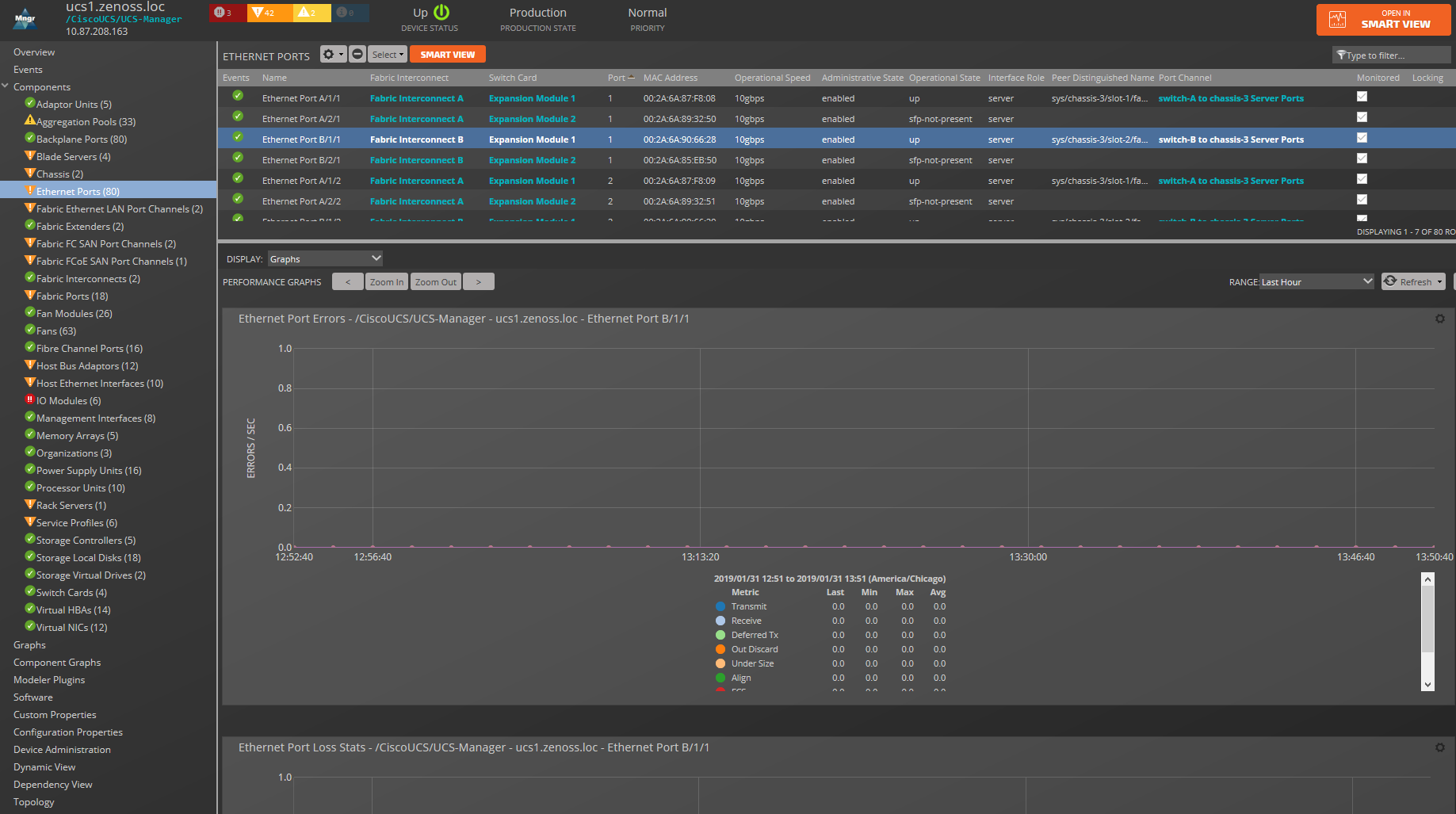
Graphs (Performance)
The Graphs view shows performance graphs that are defined for the device or component. To access graphs, in the left panel, select Graphs.
You can control the following performance graph options:
- Time range controls - To narrow or expand the size of the time range, click Zoom In/Zoom Out. To scroll through time on the graph, click the forward and back arrowheads. Clicking these controls automatically puts you into a custom time range. You can also Zoom In and center around a graph point by clicking the point inside the graph. This will center the graph around the selected point. If there are other graphs displayed in a view, they will also be affected by any change to the range.
- Range - Select the span of time
that the graph displays. Depending on the range, data may be
downsampled.
By default, the behavior is to display an average per downsampled
point, but it can be changed on a per-graph basis (see below).
- Last Hour - This is the default view and no aggregation/downsampling occurs in this view.
- Last 24 Hours - Data is downsampled to 5-minute points.
- Last Week - Data is downsampled in 1-hour points.
- Last 30 days - Data is downsampled in 6-hour points.
- Last Year - Data is downsampled in 10-day points.
- Custom - Select the Start and End time to display. To set the end time to the current time, check Now. After changing a custom range setting, click Refresh to update the graph. Data displayed in this view may or may not be downsampled, depending on the range chosen.
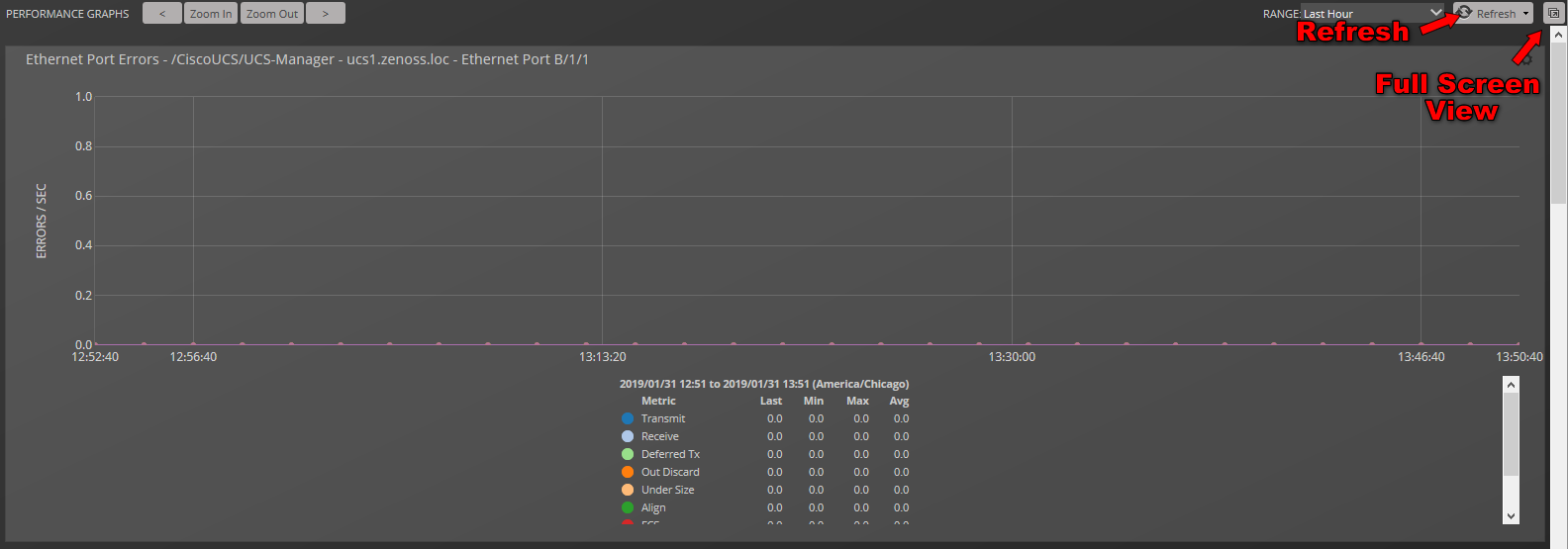
- Refresh - To modify the refresh value (by default, 30 minutes), click the drop-down list. If you set the refresh rate to manual, click Refresh each time you want an updated graph.
- Pop-out - To render the current graphs in full-screen mode, click the icon in the upper right corner of the page.
-
Downsample method - To set the downsample method, choose the drop-down in the upper rigt corner of a graph. There are four options:
- Min - the minimum value during the downsampled range
- Max - the maximum value during the downsampled range
- P95 - calculates the 95th percentile during the downsampled range
- Avg - (default) the average value during the downsampled range
-
Action (gear) - To open a submenu of the following actions, click the icon in the upper right corner of the graph.
-
Definition - View the JSON definition.
-
Export to CSV - Export datapoints as a .csv file for use in a spreadsheet. Only data contained in the defined range will be included.
-
Link to this Graph - Generate a link to this graph to save in browser bookmarks or use the URL to directly point to the graph in another Web page.
Note
If a graph has more than 28 graph points, you may receive an error stating "Unable to generate link, length is too great" when trying to link to it. This is a known limitation and no workaround exists.
-
Expand graph - Render the current graph in full-screen mode.
-
-
Table Legend - To highlight a particular data set, hover the pointer over a legend description. To toggle the displayed legend description, click it. A solid dot indicates that data will be displayed. A hollow dot indicates data will be hidden.
Datacenter view
Collection Zones provide a visual representation of devices (such as servers or blades) and device containers (such as racks or chassis).
With this feature, you can create a custom view that represents a physical space (such as a data center) by customizing the view background. You can then overlay this view with active representations of your devices and device containers.
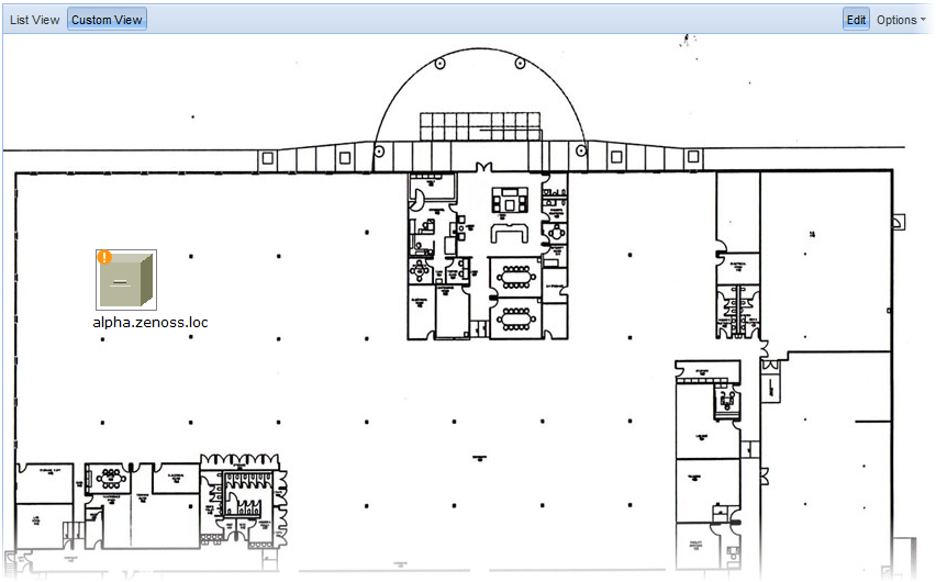
For each device or device container, the system can generate a rack view, which diagrams the physical location of devices in a chassis or rack. Each represented device provides at-a-glance information about its status.
Before a device or sub-location can appear in Datacenter View:
- At least one organizer must be configured
- At least one device or sub-organizer must be included in a location
To see the auto-generated rack view, you must set a rack slot value for the device.
List View
The List View provides a view of your devices (or, if configured, the Rack View). Follow these steps to access the List View:
- From the interface, select Infrastructure.
- In the Devices hierarchy, select a location, group, or system.
- Click Details.
- Select Datacenter View.
After you create a Custom View, that view appears by default.
Custom View
The Custom View lets you create a visual representation of your physical space (such as a data center).
To access the Custom View, from the Diagram selection, click Custom View.
You can edit the Custom View to:
- Add or change a background image
- Move or resize device images
- Remove the view
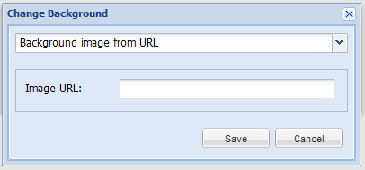
Add a background image
Follow these steps to create a custom view and add a background image to the view:
- From the Datacenter View page (accessed from the Diagram selection), click Custom View.
- Click Edit to enable edit mode. The Edit button highlights to indicate that it is active, and Options selections become available.
- Select Options > Change Background.
- In the Change Background dialog, select Background Image from URL.
-
In the Image URL field, enter an image location, and then click Save. Any image format and size supported by your browser can be used.
Remove a background image
To remove the current background image from the Custom View:
- From the Custom View area, click Edit.
- Select Options > Change Background.
- In the Change Background dialog, select No background image from the list of options.
- Click Save. The image no longer appears in the view.
Using a custom view
Devices in the custom view can be moved and resized. To work with devices in this view, click Edit. You can then drag devices to a specific location in the view, and resize them to accurately represent your physical space.
You also can view device details from this view. Click the device to go to its Status page.
Note: To access device status, you cannot be in edit mode.
Removing a custom view
Removing the custom view removes the view and custom background image, if any. To remove a custom view:
- From the Datacenter View page (accessed from the Diagram selection), click Custom View.
- Click Edit to enable edit mode.
- Select Options > Remove Custom View. The custom view no longer appears by default. If you select Custom View, devices still appear in the view; however, they are reset to default positions and sizes.
Activating the auto-generated rack view
First, ensure that the device is included in a location. Then follow these steps to make devices visible in Datacenter View.
- Select a device, from the list of Devices, click Details, and then click Edit.
- Enter values for Rack Slot. For more information about specifying values, see the next topic.
- Click Save.
The device appears in Datacenter View.
- In the List View, it appears as part of a rack illustration. The rack illustration becomes the default image in the List View.
- In the Custom View, it appears as a single device image.
Note: You can customize the device image by modifying the zIcon configuration property in the device class.
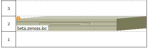
Rack view specification syntax
The specification of a rack view features two required and two optional key-value pairs, which are described in the following table. The value for each key is a positive integer.
| Key | Type | Description |
|---|---|---|
ru |
Required | The lowest rack unit used by the device |
rh |
The height of the device, in rack units | |
st |
Optional | The rack slot |
sc |
The slot capacity (only for chassis devices) |
The syntax of a rack view
specification is a comma-separated list. The following example specifies
a 1u device in the second rack unit for a device named beta.zenoss.loc:
ru=2,rh=1
In the preceding example, no rack slot value is included, because there is only one device.