Stoplight tile
The Stoplight tile provides a summary of the status of one metric or of one entity and one metric. Like the Metric Outliers tile, this tile uses thresholds to determine the status. You choose the metric to observe and the colors to associate with each threshold.
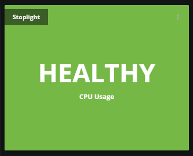
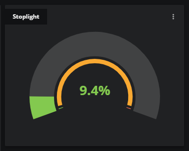
You can configure the tile to display a simple message and color (the default visualization) or a gauge, which includes the current metric value or aggregated value.
Example tiles
Configure your tile
When editing a dashboard, click the Add tile button to open the AVAILABLE TILES panel, then select the Stoplight tile. The STOPLIGHT panel opens.
Tile configuration options
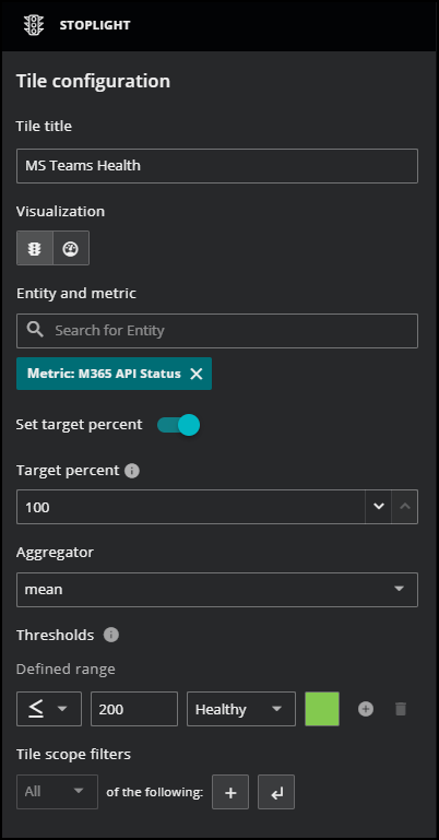
- Tile title
- The text that appears in the upper-left corner of a tile.
- Visualization
- Toggle controls to select a visualization, default or gauge.
- Entity and metric
- The search field for finding entity and metric names in the dashboard's scope. If a search term matches both entities and metrics, both are shown, in separate lists.
- Set target percent
-
Choose if you want to apply a target percentage of time or not when a metric exceeds the specified thresholds. By default, this option is turned off.
-
When set to off, you can’t set "Target percent" and only the most recent metric value is considered for thresholds.
-
When turned on, you must enter a "Target percent" value that determines if the most recent value exceeds the threshold for the specified percentage of the time range.
-
- Target Percent
- The percentage of the dashboard's current time range in which a metric's data points must meet the defined threshold or thresholds. To set this value, you must turn on Set target percent.
- Minimum/Maximum
- (Optional) This option is only available when the gauge visualization is selected. Specify the minimum and maximum values of the gauge in the unit type of the metric you specify. The default values are 0 and 100.
- Aggregator
- The arithmetic function to use to combine metric data points for threshold evaluation.
- Thresholds
-
Specify the following fields to set one or more threshold criteria with a corresponding color for representing the selected status. For more information, see Threshold evaluation.
Comparison operator Set the comparison operator for the threshold evaluation, such as "less than" or "greater than or equal to." Threshold value The data point value to use in the comparison. Label Select a description for the threshold used in the tile, such as Critical, Error, or Healthy.
Color Choose the color to apply to the tile background when a threshold is satisfied. - Tile scope filters
-
(Optional) Create a specific filter just for the tile. This is useful if you need to compare different services side-by-side. For example, maybe you want to compare the performance of your services in different regions.
Use the query builder to create and apply a filter to the tile:
-
Click the + (plus sign) to add a clause.
-
To define the clauses, click in the first field to select an entity field. This field offers suggestions based on the user-friendly names in the Dictionary or from live data in your system.
-
Select your operator, then select your value. Start typing in the value field for autosuggestions based on your selected entity field.
-
To add another simple clause or add a compound clause, use the buttons in the top of your query. To remove all the clauses, click the X button in the top of the query.
-
Understanding threshold evaluation
Thresholds are evaluated in the order in which they appear in the tile configuration dialog box, and evaluation stops when a threshold's criteria are satisfied.
For example, consider an aggregated data point value of 85 and the following threshold range configuration:
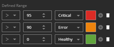
The first two thresholds are not satisfied, but the third threshold is satisfied, so in the default visualization, the tile label is HEALTHY and the background color is green.
When no data is available for the current time range, the tile label is NO DATA and the background color is grey.