Tour of the Services page
When you click SERVICES, you see the Services page with the Services panel for navigating your services and the Services canvas for viewing service health and details.
The Services panel and Services canvas work together: what you select in the Services panel determines what appears in the Services canvas.
Services panel
The Services panel is your main tool for navigating and managing your dynamic services, logical nodes, and metatype configurations.
To close the Services panel, click the menu icon in the upper-left corner of the page. Click it again to reopen the panel. You can switch between the three tabs to load different views instantly.
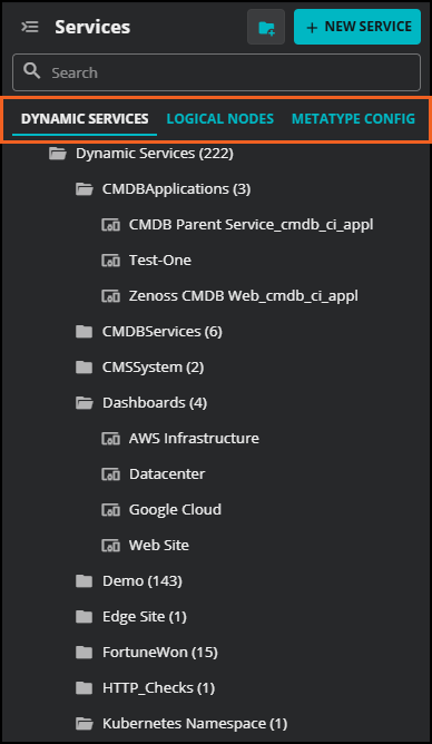
The Services panel contains a search field and three tabs: DYNAMIC SERVICES, LOGICAL NODES, and METATYPE CONFIG. Each tab displays a hierarchical list of items in that category. You can expand folders to navigate to individual services, nodes, or configuration items.
To create a new item, click + NEW SERVICE, + NEW NODE, or + NEW CONFIG, depending on which tab is active.
DYNAMIC SERVICES tab
The DYNAMIC SERVICES tab shows all dynamic services organized in folders. Expand a folder to see the services it contains. Select a service to view its details in the Services canvas.
LOGICAL NODES tab
The LOGICAL NODES tab shows all logical nodes organized in folders. Select a logical node to view or edit its details in the Services canvas.
METATYPE CONFIG tab
The METATYPE CONFIG tab shows the list of configuration items available for the service impact model. Select a configuration item to view its details in the Services canvas.
Services canvas
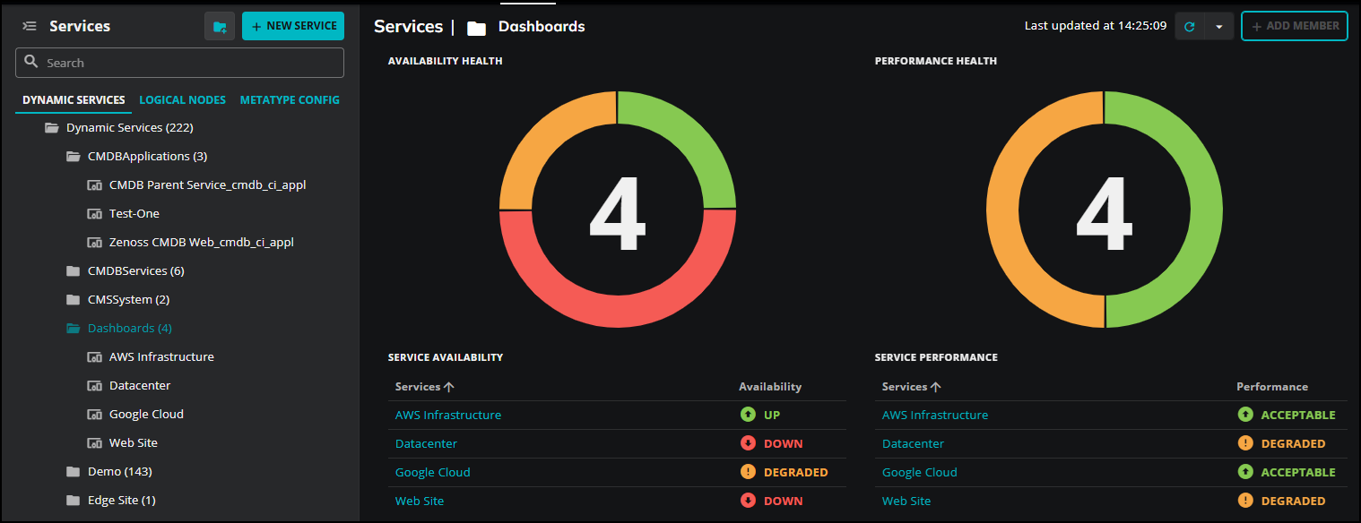
When you select a folder in the Services panel, the Services canvas shows an availability and performance summary for all services in that folder.
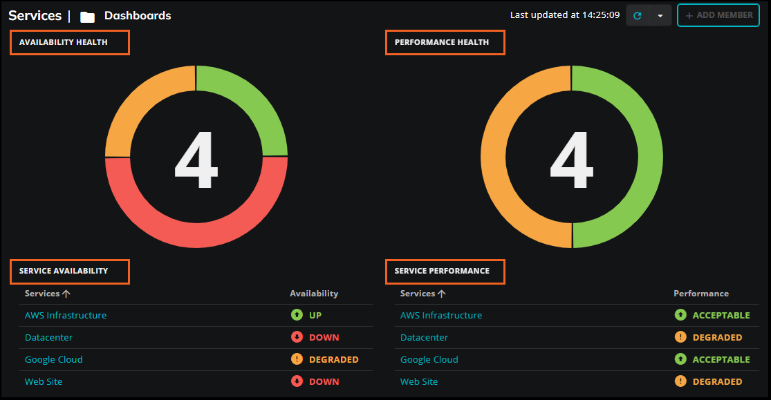
The summary includes the following:
-
AVAILABILITY HEALTH: A donut chart showing the distribution of availability states across all services in the folder.
-
PERFORMANCE HEALTH: A donut chart showing the distribution of performance states across all services in the folder.
-
SERVICE AVAILABILITY: A table listing each service in the folder and its current availability state.
-
SERVICE PERFORMANCE: A table listing each service in the folder and its current performance state.
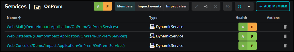
When you select a specific dynamic service in the Services panel, the Services canvas updates to show the Members, Impact events, and Impact view tabs for that service. For more information, see Dynamic service views.
Auto refresh
The Services canvas shows the time the data was last updated. By default, the Services canvas does not refresh automatically. If you are actively monitoring a service during an incident or troubleshooting session, enabling auto refresh ensures you are seeing the most current state without manually reloading the page.
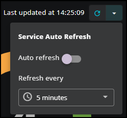
To configure automatic refresh, click the dropdown arrow next to the refresh icon and use the Service Auto Refresh control. Toggle Auto refresh on, then select a refresh interval from the Refresh every dropdown menu. Available intervals are 5 seconds, 10 seconds, 30 seconds, and 1 minute.
Dynamic service views
When you select a specific dynamic service in the Services panel, the Services canvas updates to show details for that service. Three views are available, accessible from the tabs in the upper right: Members, Impact events, and Impact view.
Use the A and P buttons to switch between the Availability and Performance health types. Use Availability to investigate whether services and their members are reachable and operational. Use Performance to investigate whether services and their members are meeting acceptable performance thresholds. Switching between the two health types lets you quickly determine whether an issue is a matter of availability, performance, or both. The selected health type affects the state information displayed in the Impact events and Impact view tabs.
The following controls are available across all three views:
| Control | Description |
|---|---|
| Acknowledge | Marks the selected event as acknowledged, indicating that action has been taken to address the issue. |
| Unacknowledge | Removes the acknowledgement from the selected event. |
| Close | Closes the selected event, moving it to the archive. |
Members
The Members view lists the entities that belong to the dynamic service. The following table describes the columns in the Members list.
| Column | Description |
|---|---|
| Name | The name of the member entity. Select the name to open the entity in Collection Zone. |
| Type | The entity type, such as IpService. |
| Health | The current availability (A) and performance (P) health indicators for the member. |
| Actions | Removes the member from the service. |
To add a member to the service, click + ADD MEMBER in the upper right.
Impact events
The Impact events view shows two tables: Impact events and Related events.
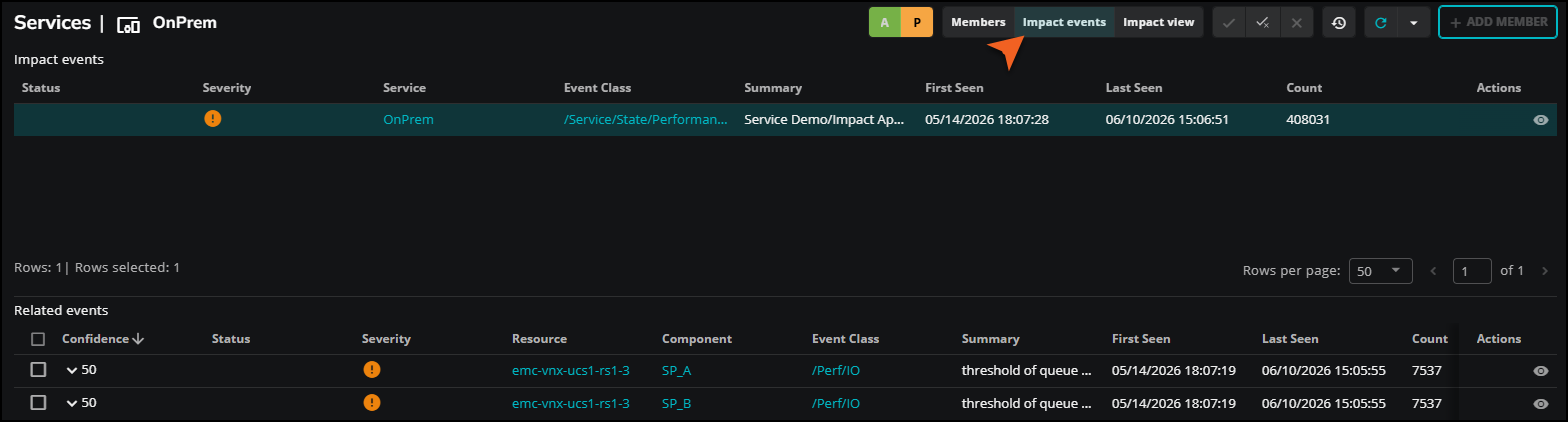
Impact events are events that have changed the state of the dynamic service. Each event in the Impact events table can be expanded to show the impact chain, that is, the hierarchy of service model members associated with that event. Use the impact chain to trace the path from the root cause through the dependency graph to the affected service.
The following table describes the columns in the Impact events table.
| Column | Description |
|---|---|
| Status | The current status of the event. |
| Severity | The severity level of the event. |
| Service | The service affected by the event. |
| Event Class | The class of the event. |
| Summary | A brief description of the event. |
| First Seen | The date and time the event was first detected. |
| Last Seen | The date and time the event was most recently detected. |
| Count | The number of times the event has occurred. |
| Actions | Opens the event details panel, which shows general information about the event including resource, component, event class, status, and message. The panel also provides access to event management details, device details, event data, and event details. 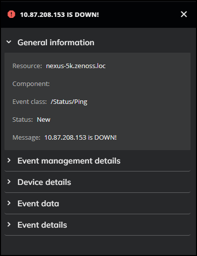 |
Related events are CZ events associated with the members of the dynamic service. The following table describes the columns in the Related events table.
| Column | Description |
|---|---|
| Confidence | A ranking that indicates how likely this event is to be the root cause of the impact event. Services automatically performs root cause analysis when an event occurs, calculating a probability value for each related event. Use confidence rankings to focus on the most likely cause first. |
| Status | The current status of the event. |
| Severity | The severity level of the event. |
| Resource | The device or entity that generated the event. |
| Component | The component of the resource that generated the event. |
| Event Class | The class of the event. |
| Summary | A brief description of the event. |
| First Seen | The date and time the event was first detected. |
| Last Seen | The date and time the event was most recently detected. |
| Count | The number of times the event has occurred. |
| Actions | Opens the event details panel, which shows general information about the event including resource, component, event class, status, and message. The panel also provides access to event management details, device details, event data, and event details. |
Impact view
The Impact view displays a dependency graph for the dynamic service. Each node in the graph represents a service member. Connections between nodes represent dependency relationships. Use the Impact view to trace the path from a root cause event to the affected service.
Where a node has hidden dependent nodes beneath it, a number appears on the connector below the node. Select the number to expand that branch and reveal the next level of dependent nodes. Select the number again to collapse the branch.
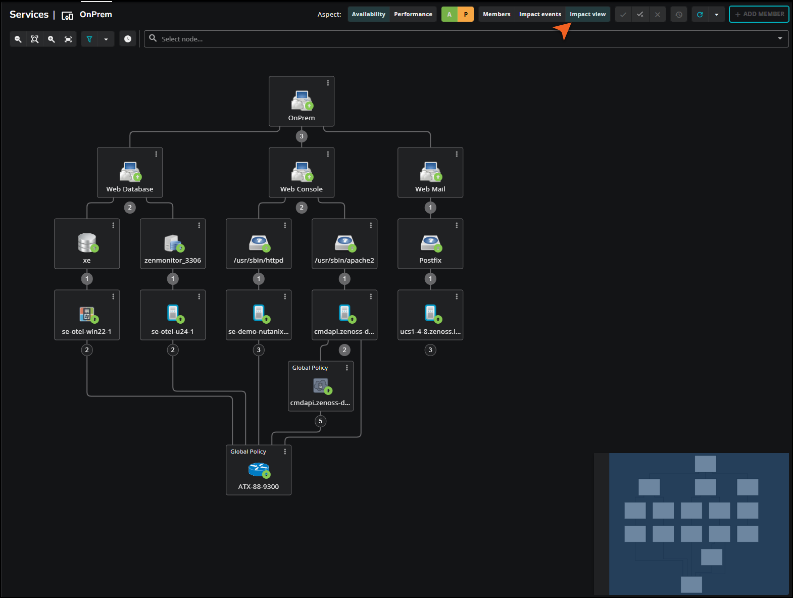
Each node has a vertical ellipsis (⋮) menu with the following options:
| Option | Description |
|---|---|
| To Front | Brings the node to the front of the graph. |
| Toggle Children | Shows or hides all dependent nodes beneath the selected node. |
| Edit Impact Policies | Opens the IMPACT POLICY dialog box where you can configure contextual and global policies for the node, and suppress service events. For more information, see Edit impact policies. |
Use the A and P buttons to switch between the Availability and Performance health types to see how each is affected across the dependency graph.
The Impact view toolbar provides the following controls:
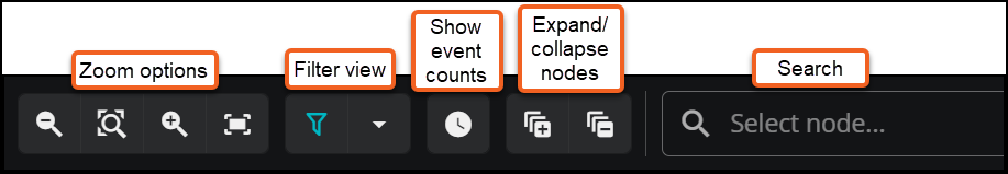
| Control | Description |
|---|---|
| Decrease zoom | Zooms out on the dependency graph. |
| Zoom to original size | Returns the graph to its default zoom level. |
| Increase zoom | Zooms in on the dependency graph. |
| Fit graph to screen | Resizes the graph to fit within the visible canvas area. |
| Filter view | Filters the nodes displayed in the graph. Click the dropdown arrow to open the Filter view panel. To filter by node name, enter text in the Name field. To filter by state, select or clear the state checkboxes (Up, Acceptable, At risk, Degraded, Down, Unacceptable). Click FILTER to apply. By default, all states are selected. |
| Expand all nodes | Expands all nodes in the graph to show the full dependency hierarchy. |
| Collapse all nodes | Collapses all nodes in the graph, returning the view to its initial state. |
| Show event counts | Toggles the display of event severity counts on each node in the graph. When enabled, each node shows the number of critical, error, and warning events currently affecting it. |
| Select node... | Opens a dropdown list of available nodes in the graph. Selecting a node from the list expands the graph to show that node and its dependencies. To show all nodes in the graph, use Toggle Children on the top-level node's vertical ellipsis (⋮) menu. |
Understanding node tiles
Each node in the Impact view is represented by a tile that conveys the node's identity and current state at a glance. Hover over a node tile to display a summary of the node's name, availability state, performance state, capacity, production state, and type.
The tile border indicates the node's derived state. Border styles vary by state:
| Border style | Availability state |
|---|---|
| Dashed orange | Degraded |
| Dashed yellow | At risk |
| Dashed red | Down |
The symbol inside the border reflects the node's actual state. For a full description of visual state indicators, see Visual state indicators.
When a policy is applied to a node, a label appears at the top of the tile indicating the policy type:
- Contextual Policy: The node has a contextual policy applied.
- Global Policy: The node has a global policy applied. If both a contextual and a global policy are applied to the same node, the tile shows Global Policy.
If you click the Show event counts toolbar button (clock icon), colored tabs appear on the right edge of each tile showing the count of critical, error, and warning events associated with that node.